Website Design Company


SEO-Optimized Website Developer in Bangladesh
Optimizing 1000+ Websites in Bangladesh and Globally for Maximum Conversions
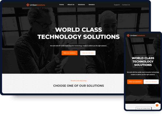
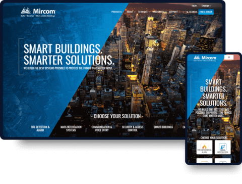
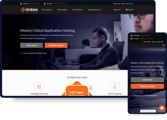
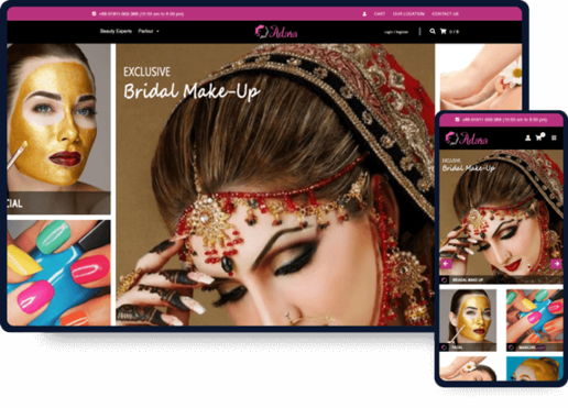
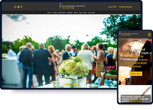
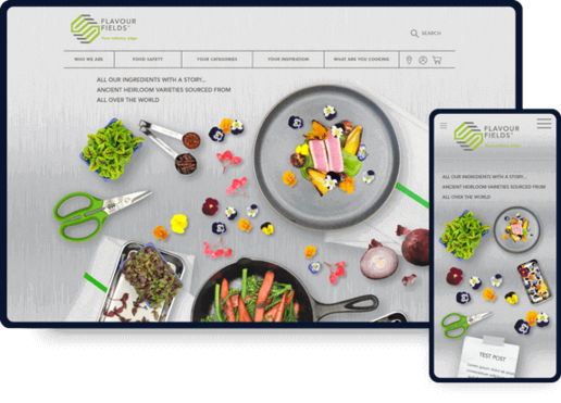
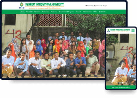
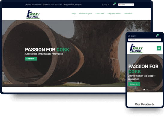
As the leading web developer, we truly believe that our collection of website designs speaks for itself, showcasing our expertise and commitment to quality execution.


We Are Featured In


Check Your Website’s SEO Score
Enter the Domain or Page URL and Keyword to get an SEO report in less than a minute.
(URL Example: https://yourwebsite.com (or) https://yourwebsite.com/your-page-url/) (Keyword example type: seo company (don't type) seo company, seo agency
Best Web Design Company in Bangladesh lead by Experts
How Our Top-Rated Web Developer in Bangladesh Can Serve You?
As a top website development company in Bangladesh, we don’t just build websites; we create custom-designed journeys tailored specifically for you.

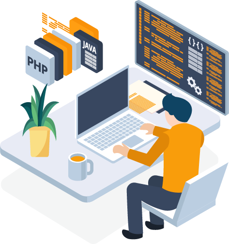
Highly skilled Front-end & Back-end Developer
Front end and Back end are the two most crucial aspects in our Web design company in Dhaka to become successful. Both of the aspects’ scope of work are quite different but linked up with each other.
For a successful website design and development, each side needs to communicate and operate effectively. We have expert front-end and back-end developers who know very clearly what they are doing.
As the best web design company in Bangladesh, we specialize in converting your visual ideas into coding.
Our front-end and back-end development ensures your business website procures more security, scalability, and agility.
At the same time, Our creative guideline ensures that your website gets found on Google.
Web Design Pricing
Superior User Interface
Whatever website design requirements you might have, be it a simple website design or a feature-packed, data-driven website – we have a full-fledged web design company in Bangladesh solution for you. We have great knowledge of website UX & UI.
As the best web design company in Bangladesh, our web design has a great UI which always results in a positive user experience.
Our designed website is always refined with all the latest technology and methodology.
The use of a modern website framework ensures our website is not only embedded with a lot of interesting features but requires less code to get the work done; which makes it less stressful for the developer as well as for you
Website Pricing
SEO Optimized Website
Developing an SEO-optimized website can significantly improve its visibility on search engines and attract more organic traffic.
By offering SEO Service in Bangladesh, we can help you to develop a professional-looking and user-friendly packed website development helps to strengthen your online presence. Customers are also most likely to consider those businesses more credible who have an excellent online presence than those who do not have a website or a poor online appearance.
We do not just develop a website, we take care of it from the SEO perspective. Our 100% SEO-friendly website development service, helps you to get stronger backlinks and lower bounce rates which ultimately translates into high search rankings.
Web Development Pricing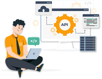
API Integration
API integration is a fundamental aspect of our web development service in Bangladesh. It involves seamlessly connecting different software applications or services to work together and share information.
APIs, or Application Programming Interfaces, serve as bridges that allow these separate systems to communicate and exchange data in a standardized and organized manner.
Through this, we empower your web design and development service to create dynamic, feature-rich, and interconnected websites that cater to the diverse needs of your clients and their users.
Web Development Pricing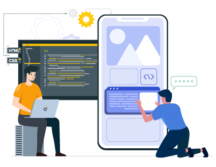
Custom Framework Development
In the realm of the best Web Development Company in Bangladesh, a framework is a structured foundation that facilitates the creation of websites and web applications by providing a set of standardized tools, libraries, and guidelines. It’s like a blueprint that we developers follow to build robust, efficient, and feature-rich digital solutions.
We design and create frameworks specifically tailored to your unique needs. These custom frameworks serve as the underlying structure upon which websites and applications are built, ensuring consistency, scalability, and maintainability.
Web Development Pricing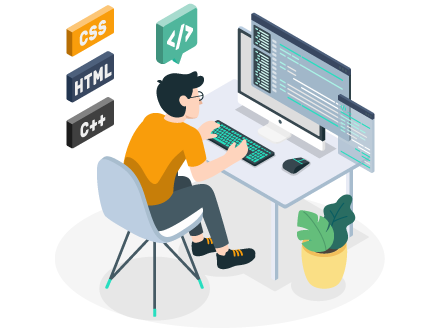
Software Development
We create software applications is a fundamental aspect of the web development services we offer in Bangladesh. In simpler terms, along with building websites, we also have the capability to design and develop standalone software applications that can run on computers or other devices.
As the best Software solution providers in Bangladesh, we have the expertise to craft custom software applications that can run on various platforms, such as desktop computers, mobile devices, or even specialized equipment.
Web Development Pricing
Mobile Apps Development
We’re skilled at designing and developing apps that run on smartphones and other mobile devices.
In the tech world we offer the best mobile app development service in Bangladesh. We craft software applications specifically designed to work on mobile phones or tablets. These apps can serve various purposes, from helping people manage their tasks and stay organized to offering engaging games or providing access to specific services.
If a business wants to offer its customers a convenient way to shop or interact on the go, we can develop a dedicated mobile app that complements their website’s functionality.
Web Development Pricing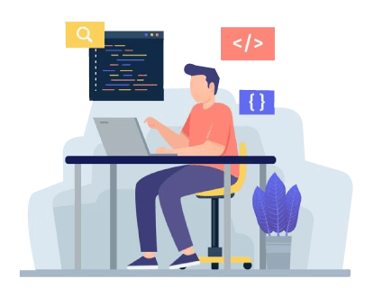
Clean Efficient Coding for better optimization
Clean coding is the website development principle and SEO Agency builds on it.
An effective but non-redundant coding is not just great for browsers but also helps a website index better on Google. The same mantra we also adopt in our web app development solution.
Clean coding has a positive effect on your website SEO as well as overall on-page loading speed.
Our minimalist custom web development work brings more out of the box strategy on-board.
Web Design Pricing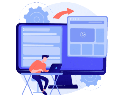
Dynamic E-commerce website design & development
We prioritize our customer needs to the highest. We believe in the theory that every customer’s design and development needs are different.
As we are the best E-commerce website development company in Bangladesh, our work is to precisely identify every consumer’s needs and recommend them the most effective website development solution.
Our Dynamic Ecommerce Website Design Solutions makes it super easy to manage large scales of data or pages. With that solution, you can log in to the control panel anytime if you feel the necessity of updating any content.
We create custom-designed Dynamic websites that’d make you stand out apart from your competitors. All our designs would be device friendly across all the platforms and screen sizes and will give you optimum results.
Web Design Pricing
Ensure High Web Security
We are the best Web Development Company in Bangladesh, helping you to incorporate high web security to make your site secure for the user. We provide an ongoing bug-tracking solution to keep the site safe and secure. We resolve all your system glitches and errors.
In our software development solution, make sure we only adopt the latest technology to make it in finest quality.
Testing is the process to find bugs and errors. Debugging is the process to fix the bugs found during testing. We identify the failure of implemented code through the different testing levels, like unit testing, integration testing, system testing, etc.
Our Security Assurance delivers such an unbeatable solution that you won’t find anywhere in Bangladesh.
Web Design Pricing
Free Technical Support for 90 days
We, the website development company in Bangladesh, offer consistent technology upgrades and an extensive array of website maintenance support that will provide the visitor with a seamless online experience. At the same time, maximize your site performance.
Our expert team of website developer agency is well-equipped to handle all kinds of website maintenance activities. We offer 90 days of free technical support to make sure your site is performing well and is available when your customer needs it.
For any emergency support, our team is always ready to do the security monitoring, maintenance upkeep, automatic backups, 24/7 emergency support, security audits, security updates, site audits, performance monitoring, performance tuning, and much more.
Web Development Pricing
Free Domain & Hosting Support
We are the best web design Bangladesh, offering free domain, hosting & SSL for the 1st year.
We have always offered domain maintenance support for every site we build. We will guide you through every step and continuously provide ongoing support to your domain when any emergency arises like domain registration, configuring your web address/ domain name, renewal, and annual domain name maintenance.
We consistently host your websites and provide 24/7 FTP access so that you can easily update your website by yourself. We also provide online traffic statistics so that you can easily see how much traffic your website receives.
Web Design Pricing
Customer-centric Web design and development company in Bangladesh
Discover 5 Key Stages of Web Design & Development Process for an SEO-Friendly Online Presence!
No matter how complex your vision is, as the best website design and development company in Bangladesh, our primary objective is to ensure you receive everything you require from your website, guided by expert web designers & SEO Experts.
WEBSITE ANALYSIS
Define website purpose, audience,
brand identity, success criteria,
analyze competitors’ sites,
and address user needs.
Technology & Resource
Select tools thoughtfully for successful
web development, UI/UX design,
framework versatility, and
responsiveness.
SEO and Accessibility
Strategically identify MVP components,
organize content, & design user flows
to optimize SEO and accessibility.
Design-to-Development
Vision & design through mood boards,
wireframes, PSD to HTML conversion
with lightweight coding
& final delivery.
Handoff Plan
Streamline handoffs & maintenance
with a plan covering style guides,
assets, support, QA, and
growth roadmap.
Leading the way in web design and development in Bangladesh
Excellence in web design and development services
As the best website design company in Dhaka, we don’t just focus on UI and UX. We ensure that the back-end is robust and efficient enough for any future updates and maintenance. Our expertise as a web design and development company in Dhaka extends to delivering top-notch solutions tailored to your needs. We specialize in providing unparalleled services as experienced web designers in Bangladesh.


How much should a new website cost?
View our Web Design Company in Bangladesh
PRICING & PACKAGE
Want to build a new identity in the online world with stunning web design & development services? Or, want to redesign your old website? Whatever service you’re probably looking for you’re main wondering question must be, How much our web design and development service cost in 2023? We are the best Web Development company in Bangladesh, offering custom-made web development solutions for small, medium & corporate businesses. To know our custom pricing, contact us. For the basic website design and development pricing, click below.
We are not only Web Design Company in Dhaka
We offer Free Domain and Hosting Support with Complete Security
If you don’t have a domain yet, our website development company in Bangladesh offers website domain and hosting service. As part of our web design service bd, we will purchase a domain on behalf of your company and configure it with the right hosting support which will be free of cost for 1 year. And we will also hand over to you the full domain ownership when required.

Basic Website Hosting
2000 TK.
Suitable for any small website design server.
- 3 GB Space
- 100 GB Data Transfer
- Free SSL
- Free Business email address
Business Website Hosting
4500 TK.
Good choice for simple business website hosting.
- 5 GB Space
- 500 GB Data Transfer
- Free SSL
- Free Business email address

Corporate Website Hosting
7500 TK.
Good choice for simple business website hosting.
- 50 GB Space
- 1 TB Data Transfer
- Free SSL
- Free Business email address
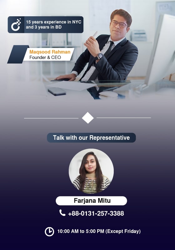
Request a Free 30 Minutes Website Design & Development Consulting Services
Looking for a free Consultation or want to learn more about our Services? Please give us a call or email us by utilizing the below information.

Contact Us by E-mail

Contact Us by Phone
Please call between 10:00 AM to 5:00 PM GMT+6, except Friday & all major Govt. holiday.
Ready to unlock conversion and traffic to your business?
Check out Most-Asked Website Design & Development FAQ before hiring!
Find out the answers to some of the most common questions about our web design and development service in Bangladesh.
Our Awesome Clients
Our Clients are our top priority. We treat them with the utmost care and they inspire us to do better with every step. We help our clients with various services such as Website Design, Software Development, Mobile Apps, Digital Marketing, Graphics Design, Social Media, Video Production, & Consultancy services to conquer their digital landscape and outrank their competitors. Contact us today to learn how SEO Agency can help you to grow your online business and take it to the next level.